Eurostar mobile app
product designer for iOS and Android app
I was invited to work on the new Eurostar mobile app as a product designer. Released in late 2017, the app became a great booking and a post-booking tool right away. Today it’s become a must-have travel companion app for Eurostar travellers.
-
The brief
To redesign the Eurostar mobile app into a customer-centric travel companion app
To optimise the booking, and the post-booking experience for Eurostar's increasing mobile traffic
-
Challenges
For MVP, we had a deadline of five months (from Jun to Nov 17).
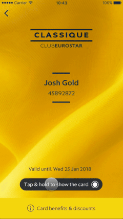
New loyalty program required back-end system changes with the new redemption rules
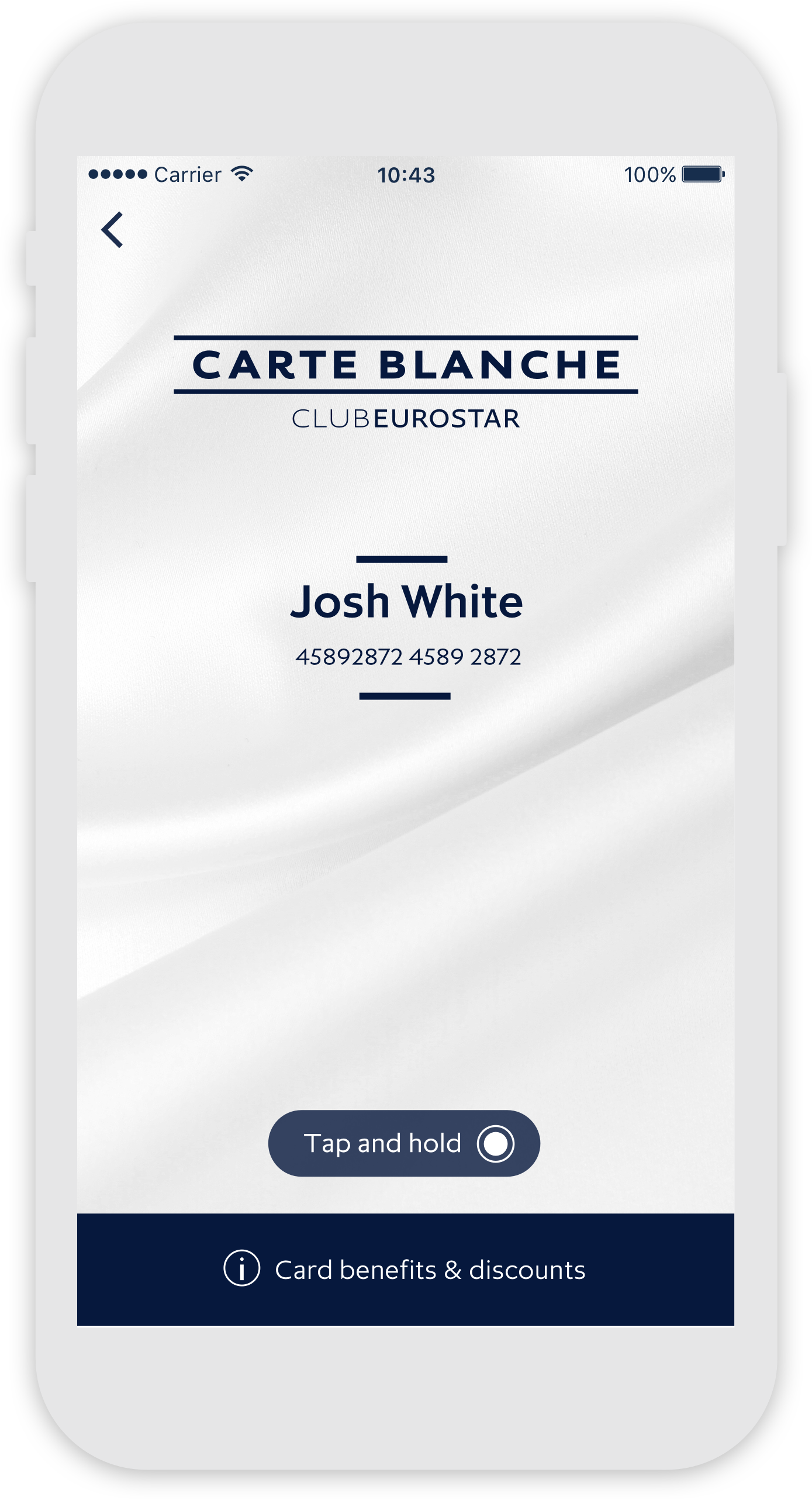
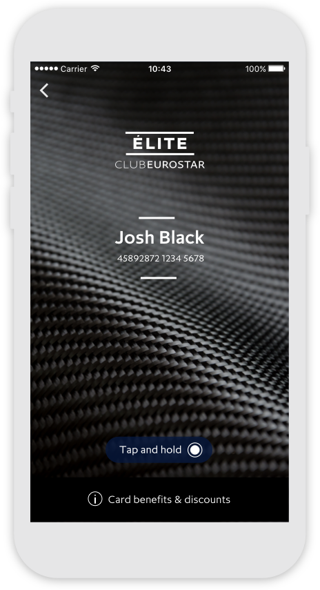
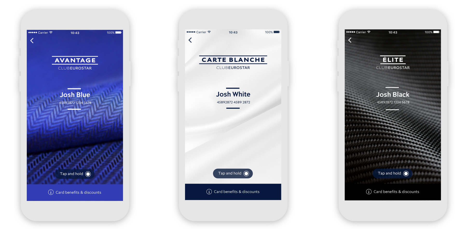
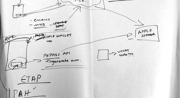
A digital ticket design with a new barcode spec was required.
Fresh brand new look for the Eurostar app
Unlike Eurostar's traditional navy-heavy colour theme, the new app needed a fresh palette. Firstly by adopting a modernised Eurostar logo, and secondly by choosing the fresh teal theme from their brand guidelines.


Microinteraction for a unique & delightful app experience
We also worked with the train on board staff and the Business class lounge staff. They told us about the challenges that they faced, such as digital card fraud. We needed to come up with a unique interactive solution, as shown in the animated example. We experimented with the screen tap interaction with Lottie animation.
-
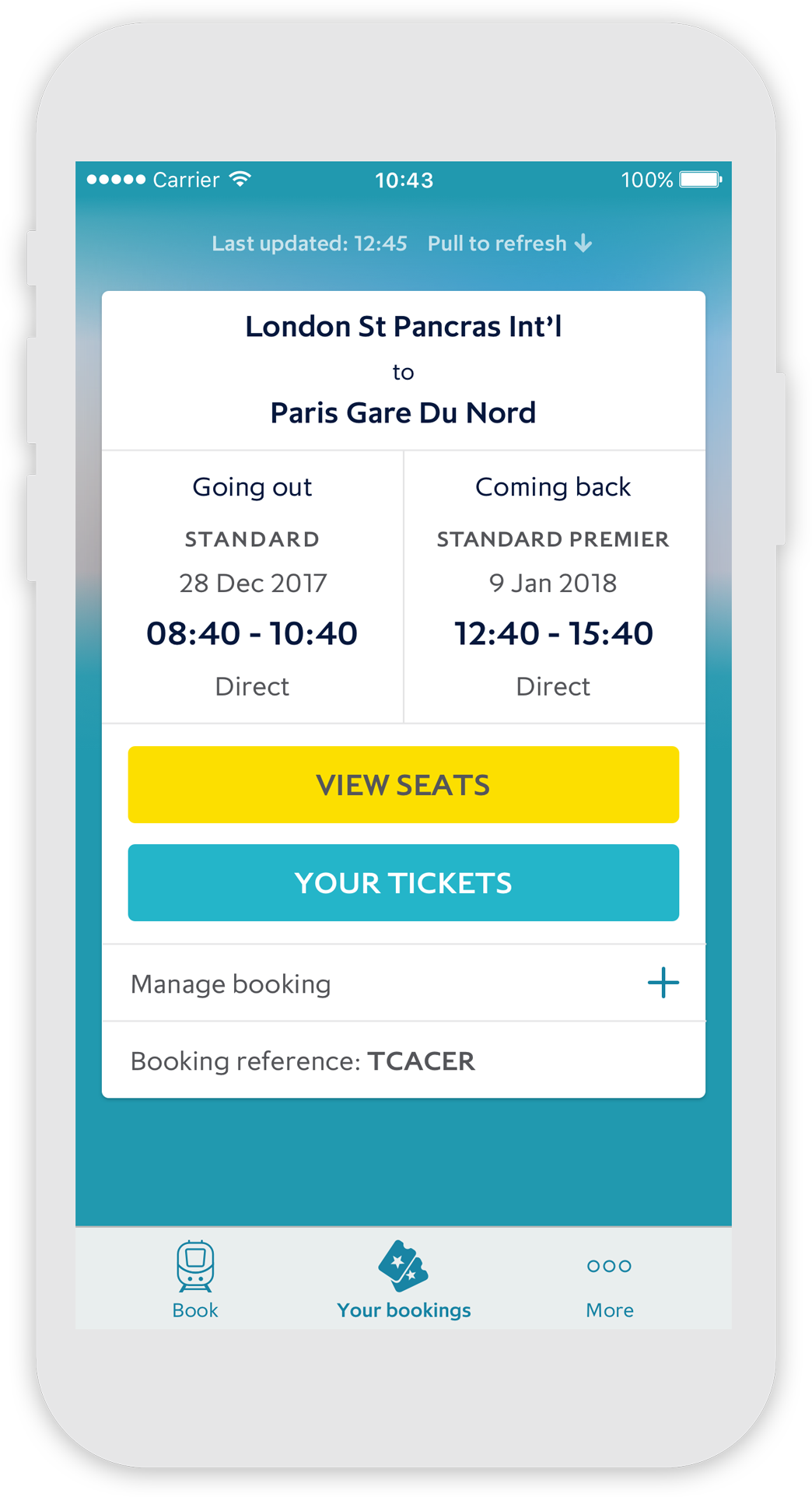
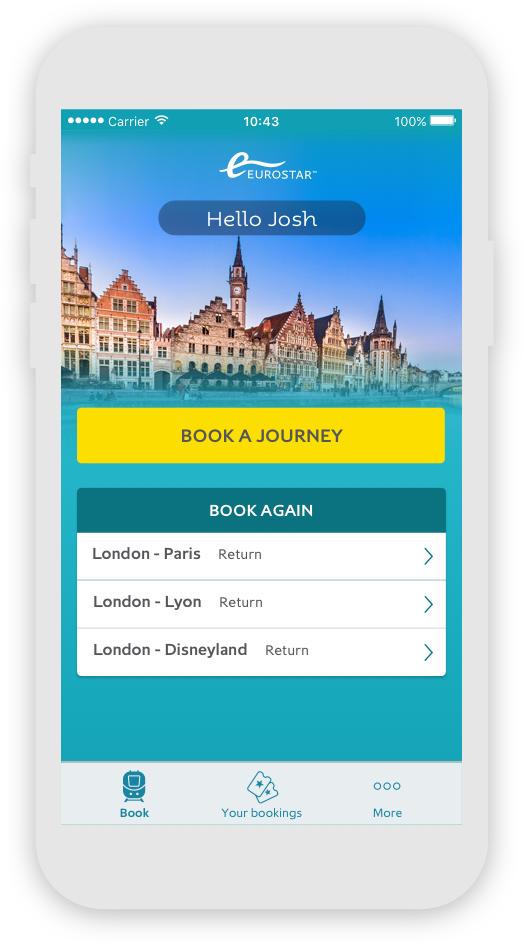
Considerations for users on the go
The booking magnet was one of the main areas of work in terms of UI / UX. My UX designer colleague and I iterated on sketches and lo-fi prototypes, and came up with a solution that would make it very easy to perform searches. We knew from the UX research that people tend to search and compare travel destinations and price whilst away from desktop pc.
The UX
Mapping the customer journey - from the booking to arriving at the destination
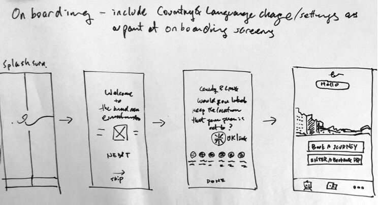
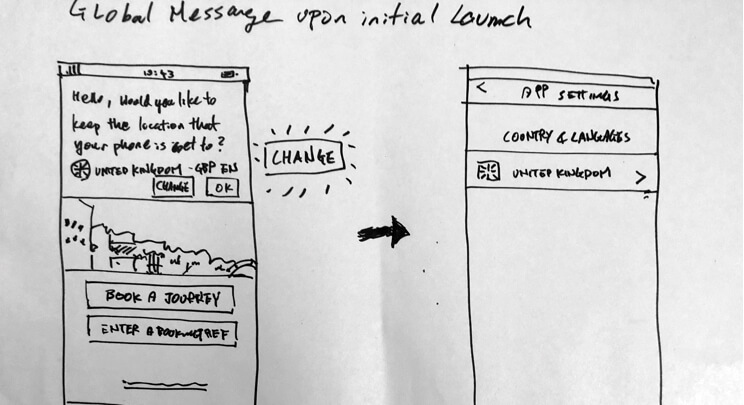
- Market selector
- Onboarding
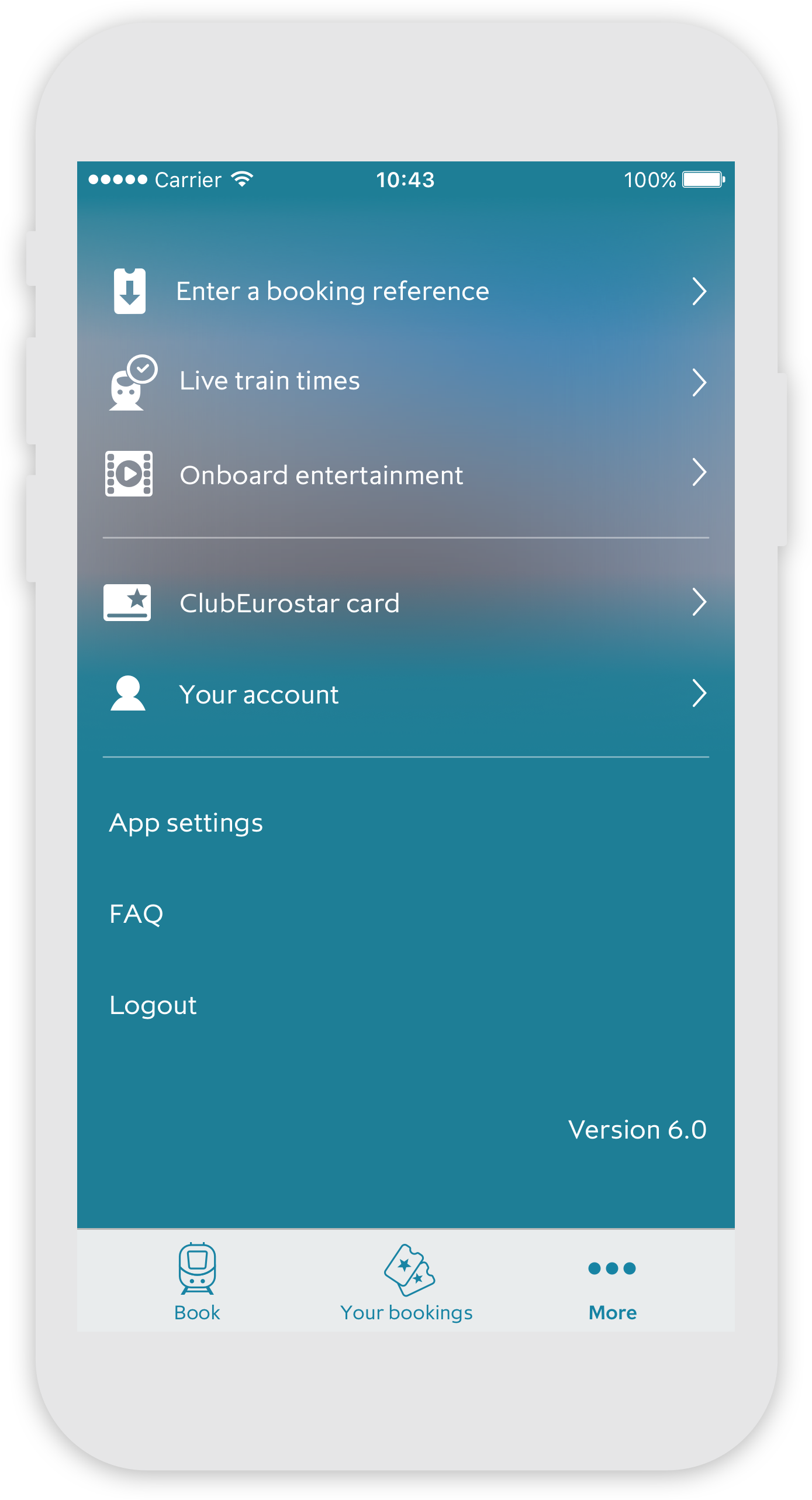
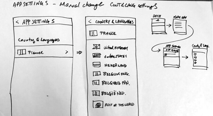
- More menu
- Market selector
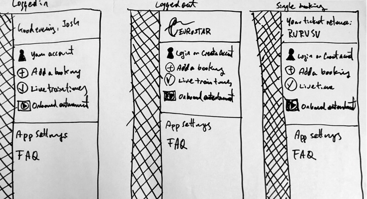
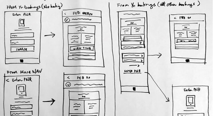
- Booking retrieval CTA
- Fig.6
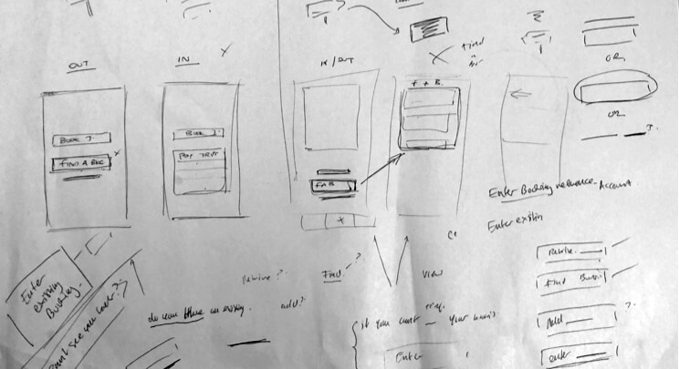
- Fig.7

- Post booking - booking confirmation / ticket retrieval
Pattern library
Colors
Typography

CTA


Alert / Feedback

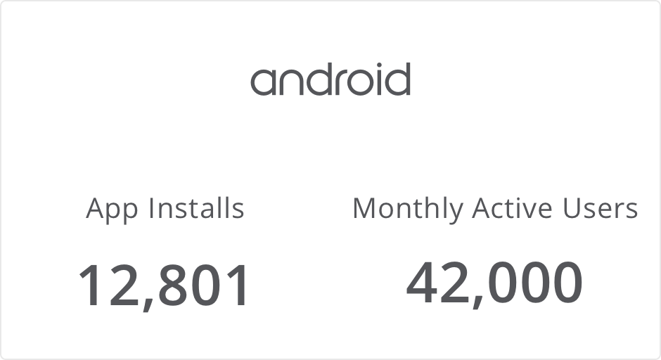
The result after the new ES app launch - December 2017