-
The problem
The last major UI refresh was done in 2016, and the experience had started to feel dated. A confusing secondary navigation below the main app bar made key actions harder to find.
The account summary screen was also overloaded with information, making it harder for customers to focus on what mattered most.
-
The challenge
The main challenge was creating a system flexible enough to work across a white-label product used by multiple retail brands.
It needed to stay configurable while still supporting each client’s branding, feature set, and product requirements.
Discovery
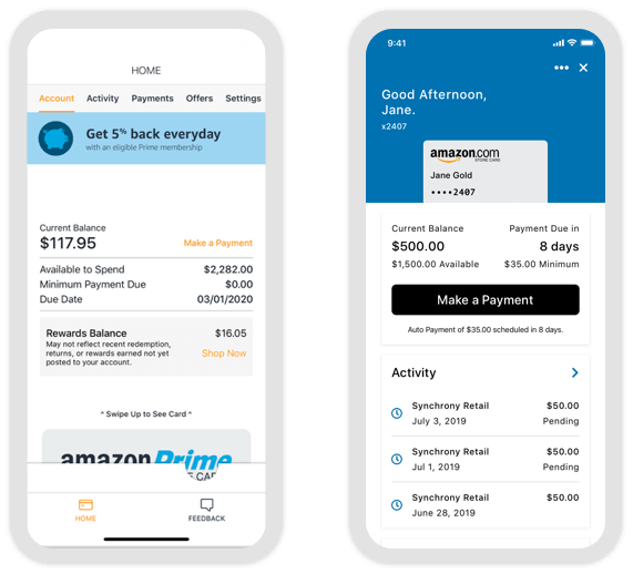
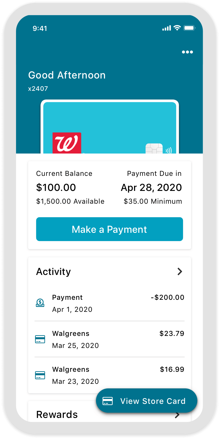
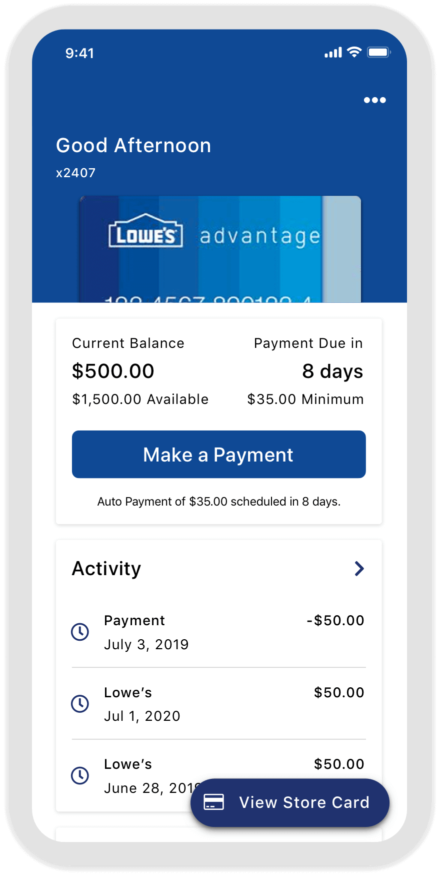
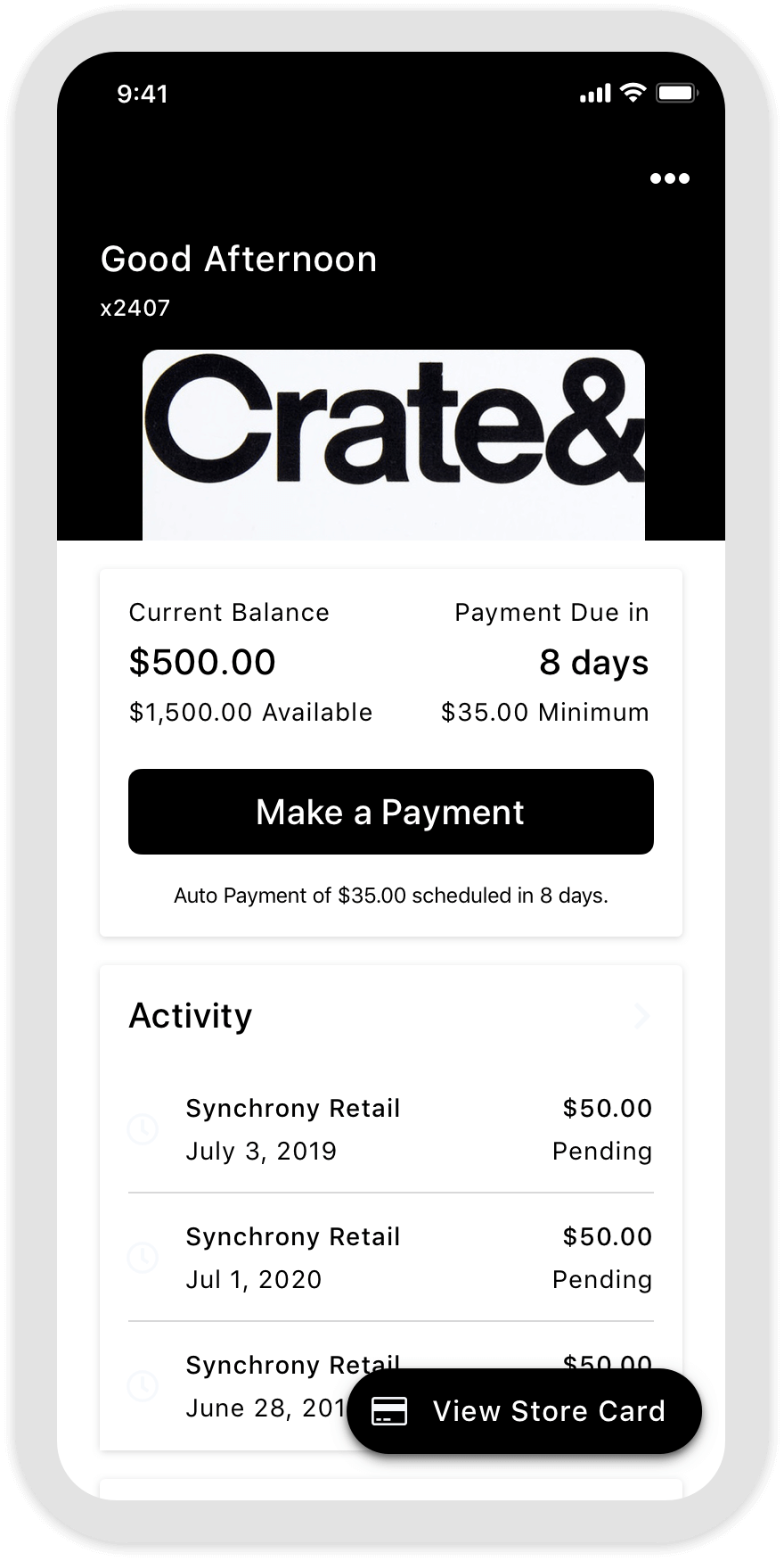
One of the key opportunities was improving how customers accessed and used their digital store card from the redesigned account summary screen.
The Problem
The existing “Swipe up to show” digital card pattern looked dated, took up too much screen space, and created a confusing visual hierarchy. I set out to redesign the experience so it felt simpler and worked more naturally within the updated account summary screen.
The Challenge
Even though the previous design took up about 35% of the screen, customers had learned how to use it. The challenge wasn’t just making it look better — it was creating something easier to discover and adopt without hurting familiarity.
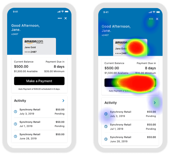
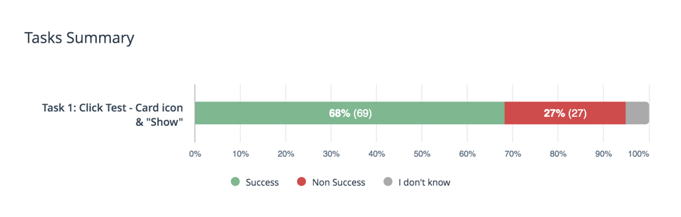
In testing, many users tapped “Make a Payment” when trying to find the digital card. I also tested changing the label to “Pay My Bill,” but behavior stayed largely the same. When I tested the card artwork itself as the trigger, discoverability performed poorly with only a 20% success rate.
Experimentation & testing
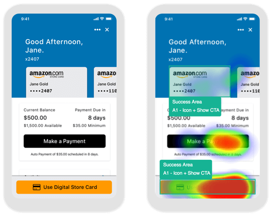
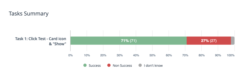
I tested a more explicit secondary CTA fixed at the bottom of the screen, along with a carousel-style account summary pattern for customers with multiple accounts. Although some users still tapped “Make a Payment,” this version significantly improved success, increasing discoverability from 20% to 68%.
The Solution
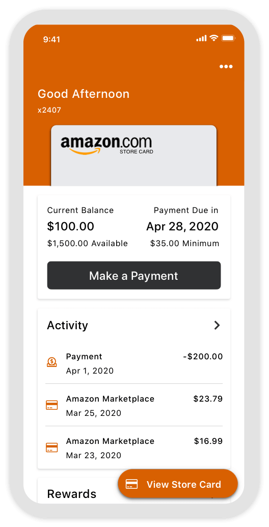
I landed on a dedicated fixed CTA for “View / Use Store Card” and explored a few bottom-fixed button treatments. I also kept the card art tappable so customers who expected the interaction there could still access the same action.
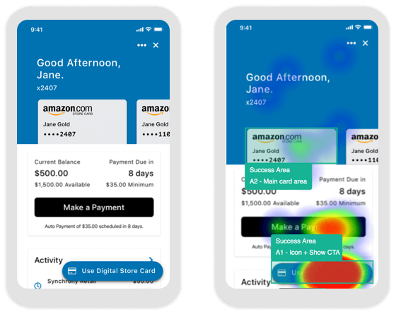
This version tested best overall. It balanced clearer discoverability with the familiarity some users still had with the card itself as an entry point.
The Result
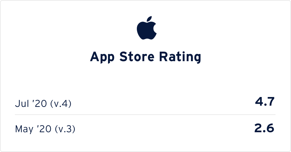
Within three days of launch, the app saw 141,765 total visits, 16,811 scheduled payments, and 12,203 digital card views. App Store ratings improved from 2.6 to 4.6 stars, while Google Play ratings rose from 3.0 to 4.6 stars.
-
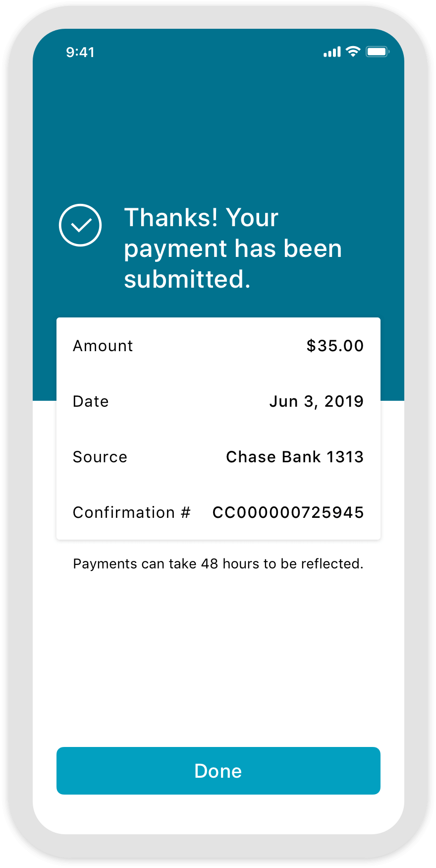
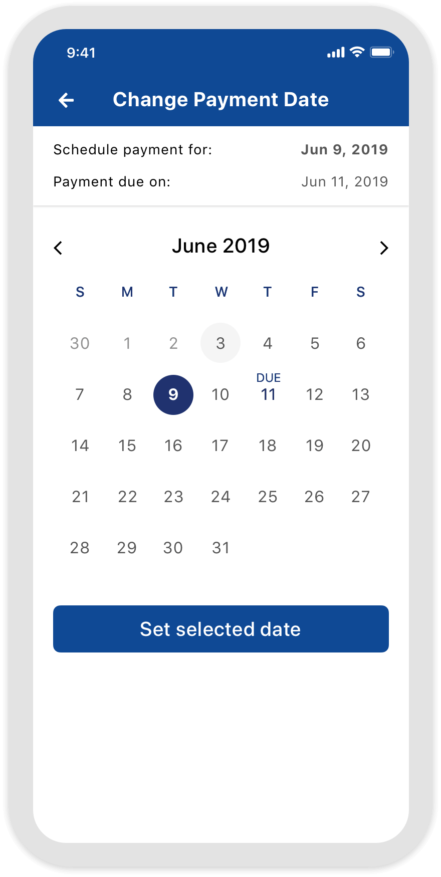
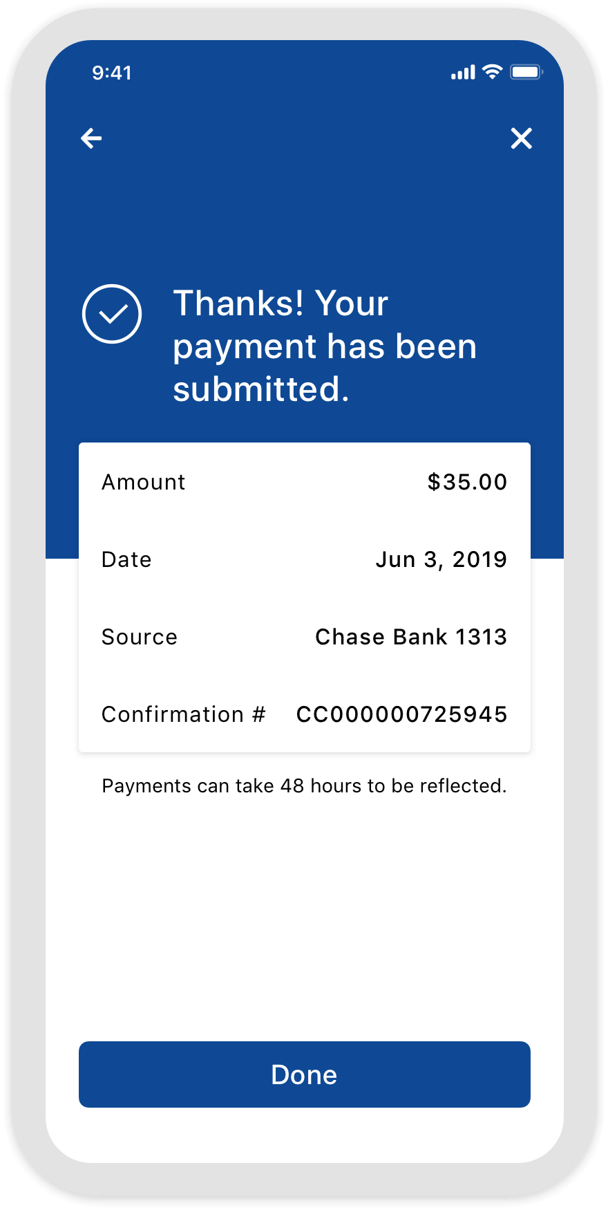
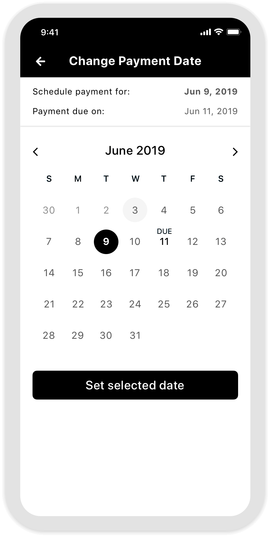
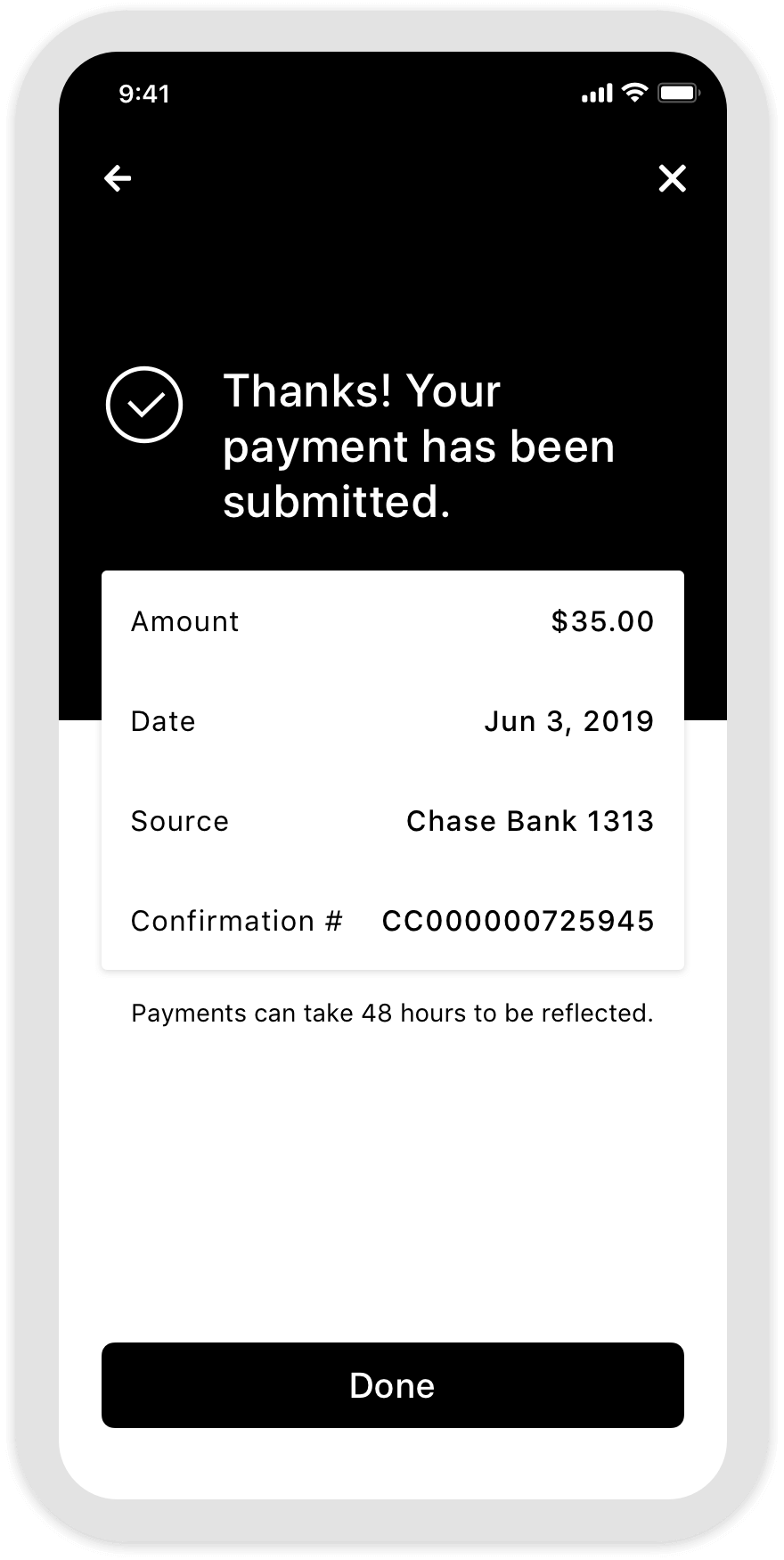
Quick Payment
The app was designed to make payments fast and easy. Key account information stayed visible on the summary screen so customers could act quickly without extra navigation.
-
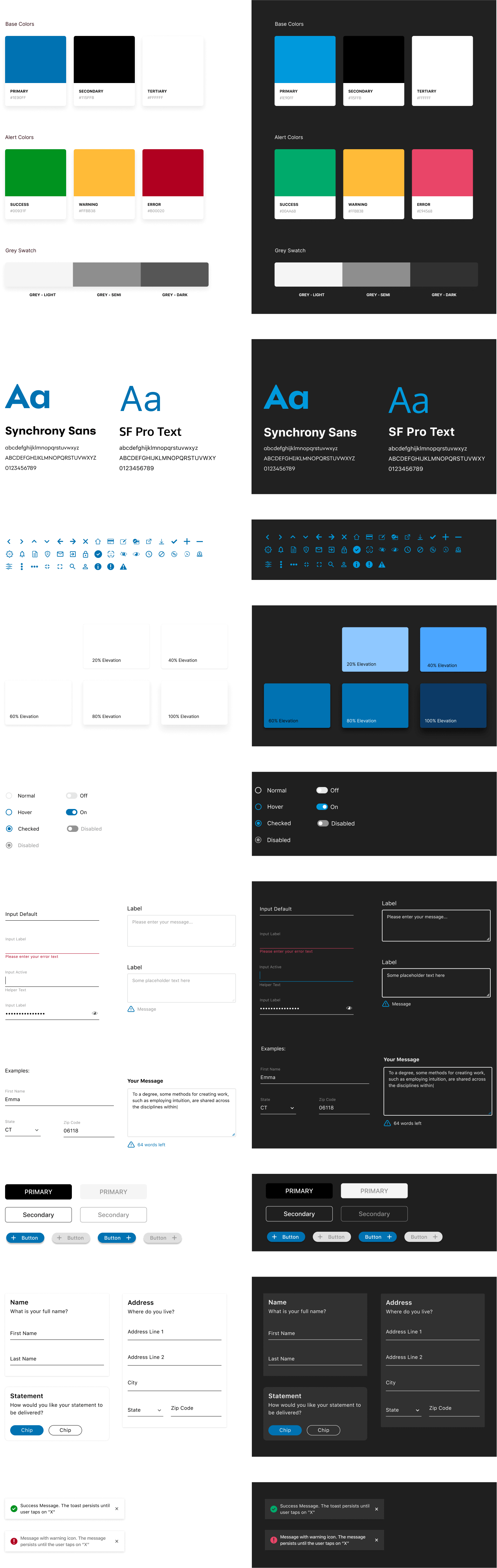
Pattern library
SYPI was a white-label product, which meant the experience needed to flex across different client brands and feature sets — from colors and logos to rewards and promotional modules. As the design team grew, I introduced a shared Figma pattern library to help the team work more consistently and scale visual design more efficiently.
The impact

Customer feedback
-
Better interface
Much easier to use. Like that the digital card is easy to find.
-
5 Stars
They finally added a Digital Card to it so it’s perfect now!
-
Amazon Card
I never knew it existed. So easy to make payments. Or use it.
-
User friendly
Saves time paying your card on the spot, very user friendly.