-
The problem
Developers were struggling to quickly find and consume content on the go. Research showed that many were accessing the platform in short, task-driven moments where speed and clarity mattered most.
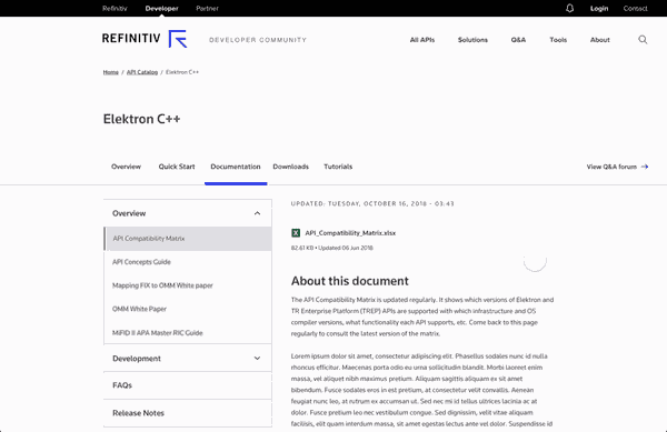
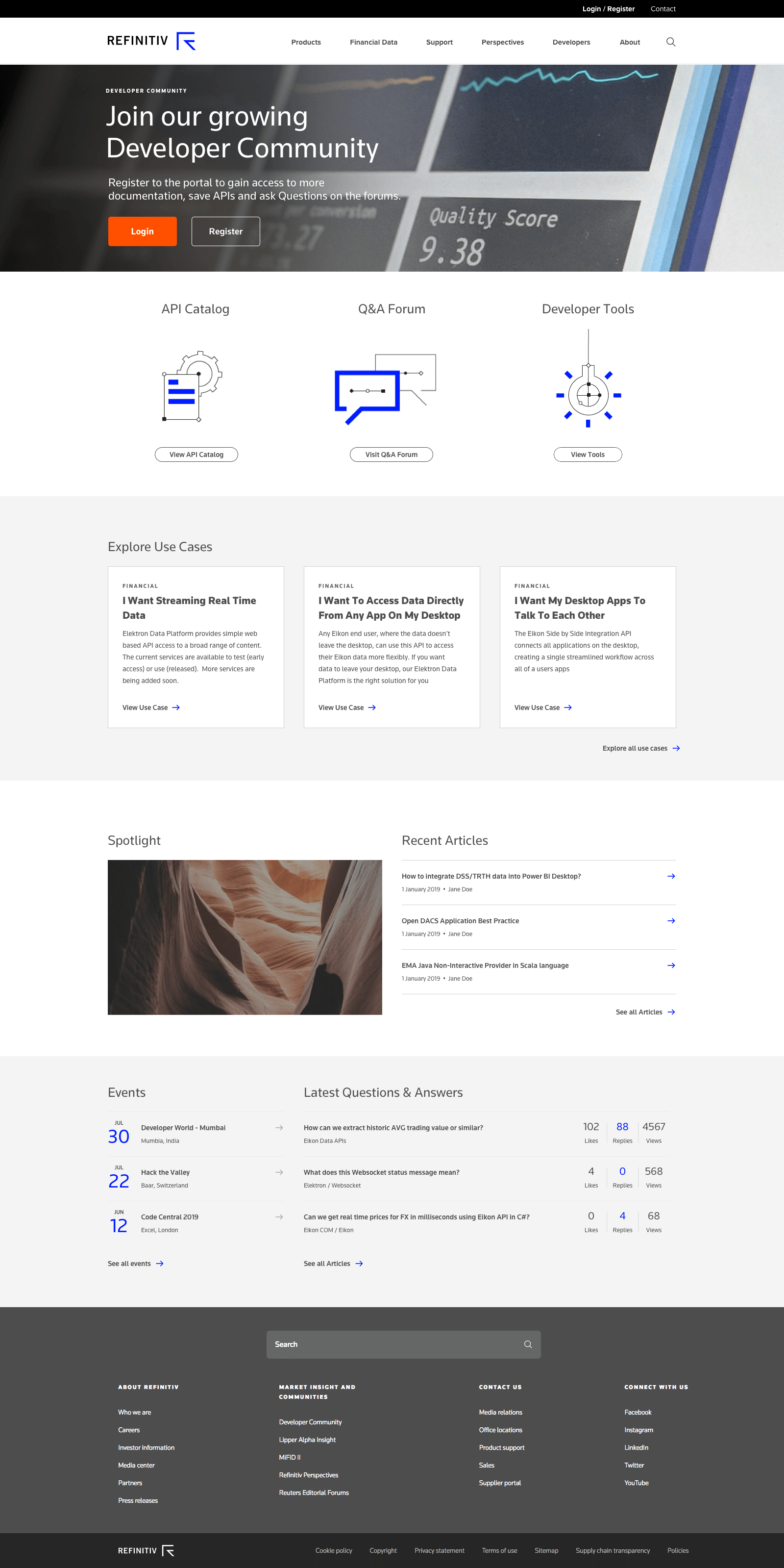
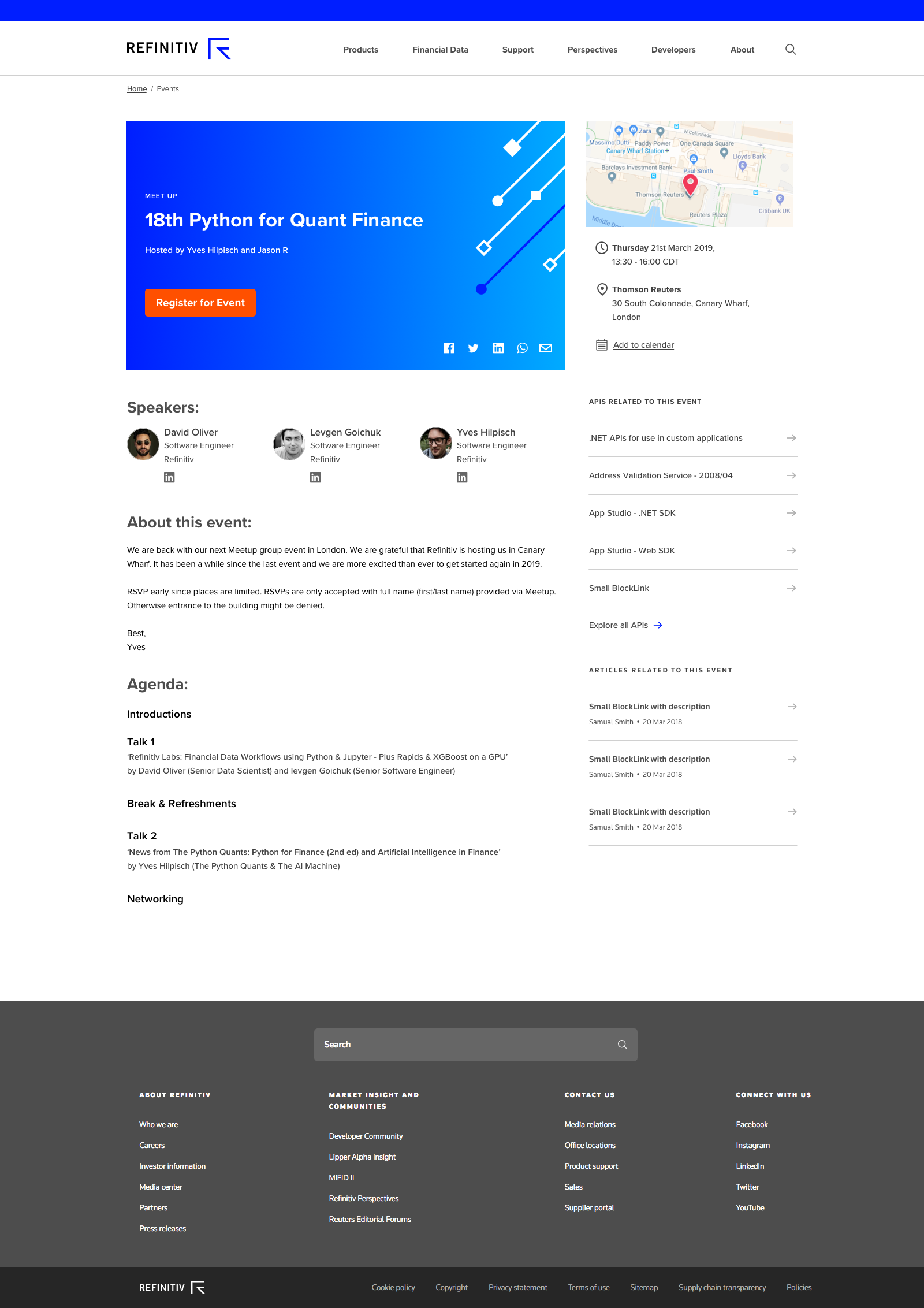
While Refinitiv’s developer community was a valuable place to learn and get support, the experience had been built mainly for desktop.
-
The solution
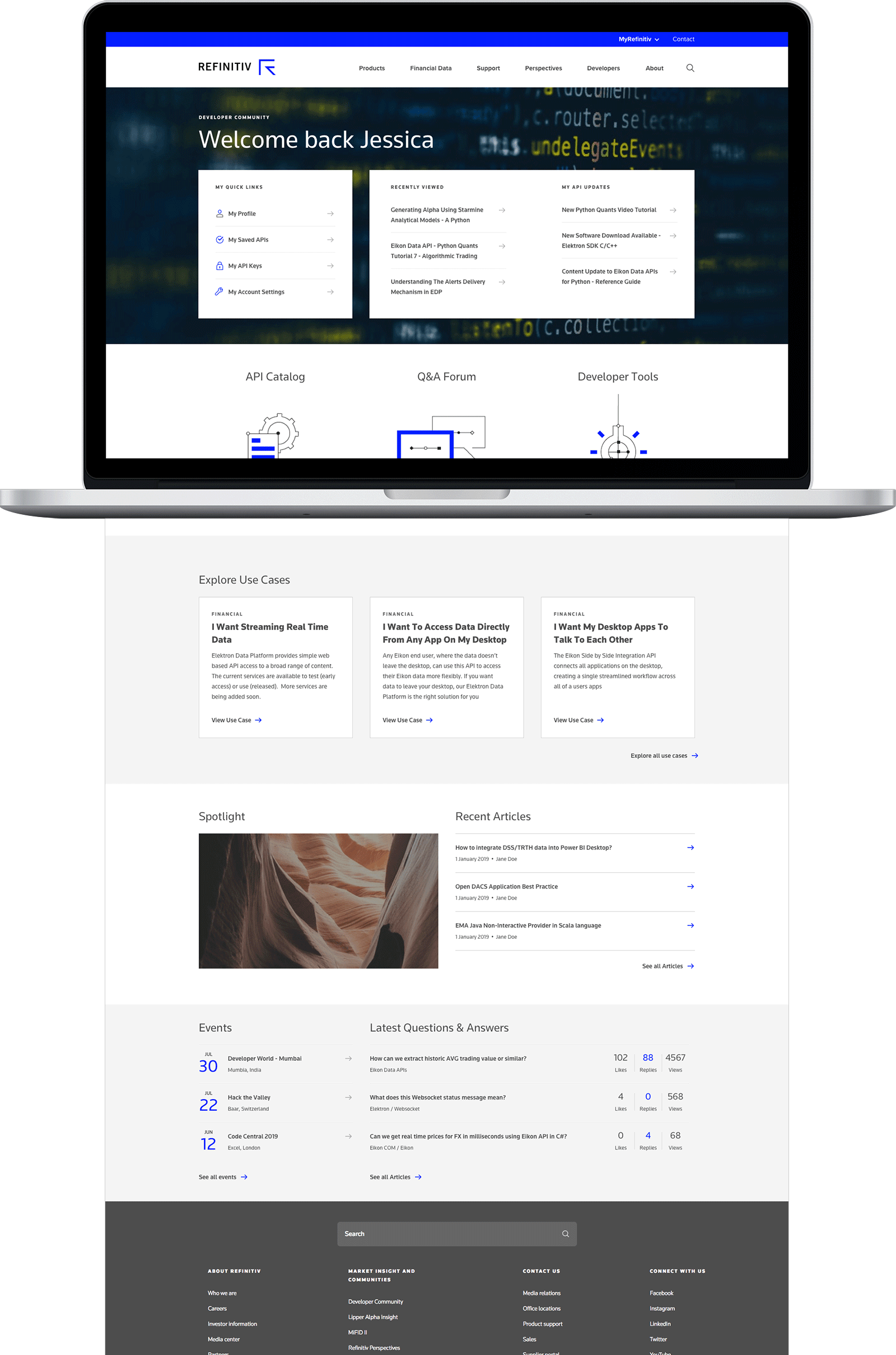
I reworked the navigation and content experience to feel more natural and usable on mobile, without losing the depth developers relied on.
The redesign made it easier to find, scan, and move through content across devices.
Discovery
Research showed that developers did not follow one predictable path to API content
User test participants explored API content various ways.
-
Quick coders searched different tabs for code examples.
-
Investigators started in Tutorials or Documentation, then moved to Quick Start and back.
-
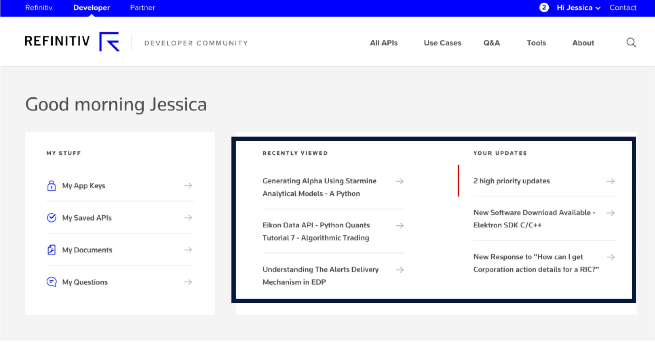
Participants found Recently Viewed and signed-in update content helpful. Two of the three users who saw these updates said they would find them useful.
-
Design takeaway: personalized content had value, but it needed to support return visits without distracting from primary tasks.
-
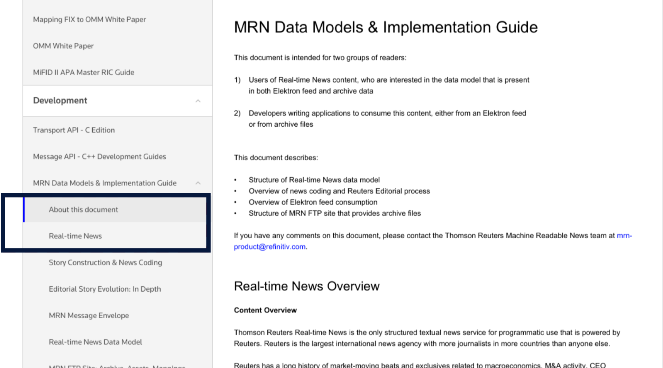
Some participants could become disoriented when using menu anchors because they behaved differently from standard navigation links.
-
Design takeaway: anchor links needed clearer visual cues and feedback so users better understood where they were going.
Interaction Design
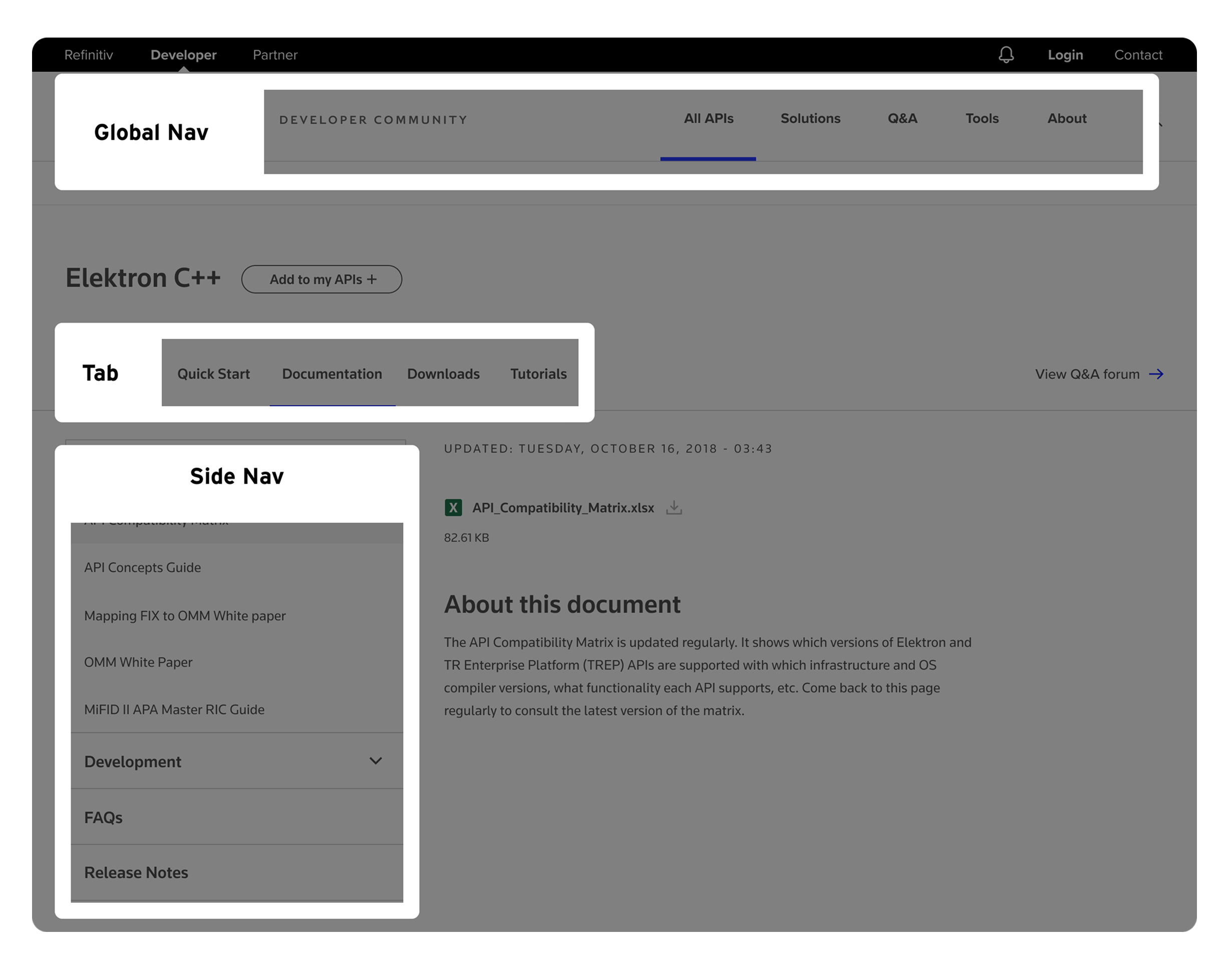
My main focus was designing a navigation model that could support different developer behaviors across mobile and desktop. The solution combined existing design pattern library components with a new side-navigation approach built for a content-rich experience.
We validated the direction through mid- to high-fidelity responsive prototypes, using InVision and HTML/CSS to test how well the navigation supported scanning, movement, and orientation.
The proposed side navigation interaction
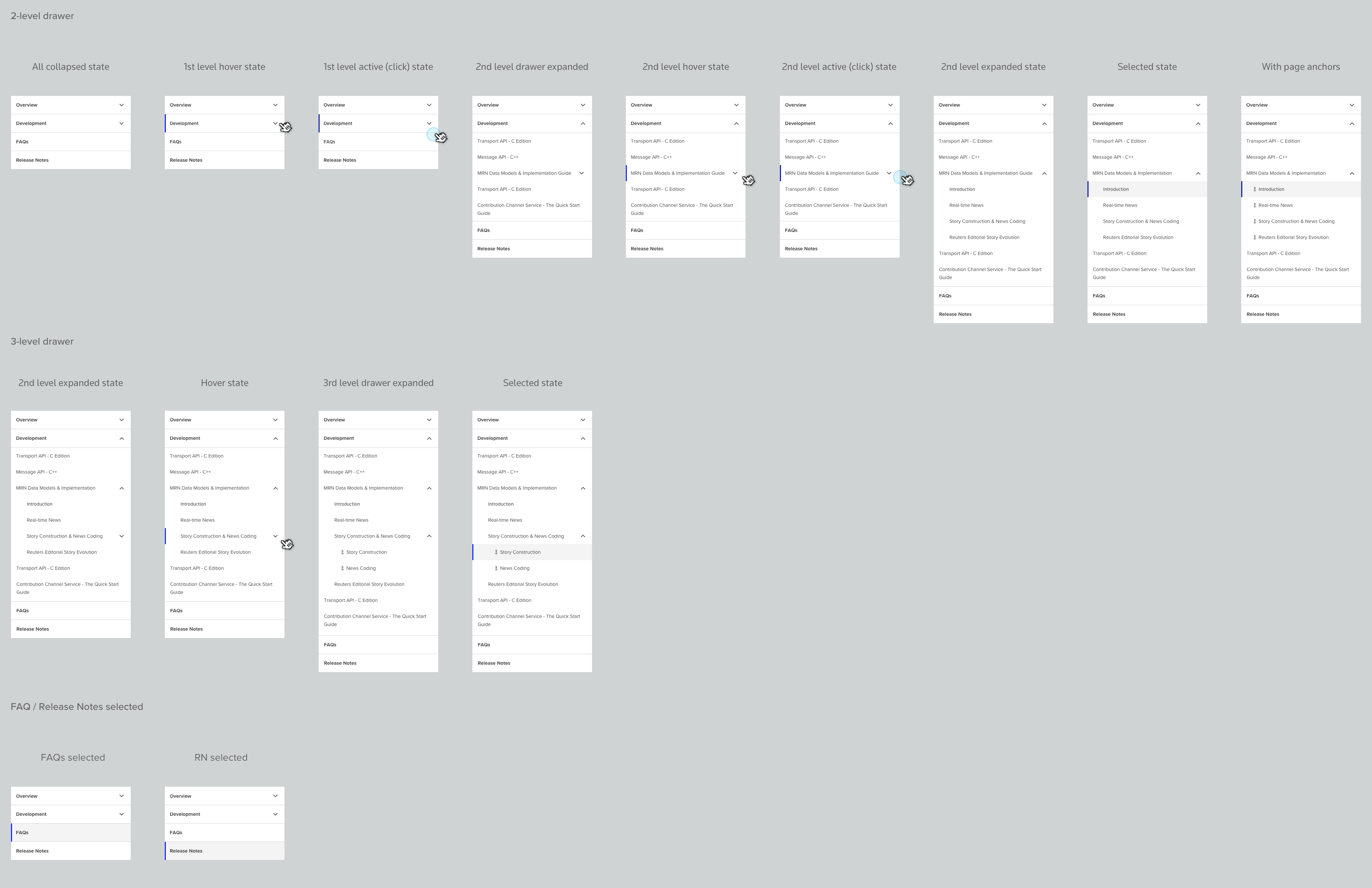
Side navigation in responsive layout

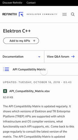
Selected UX screens
These screens show how the updated navigation and content structure came together across key experiences.
UI System
Alongside the navigation work, I helped extend the UI foundation so the experience could stay consistent as content and layouts scaled across devices.
Colors


Typography

Buttons
Forms
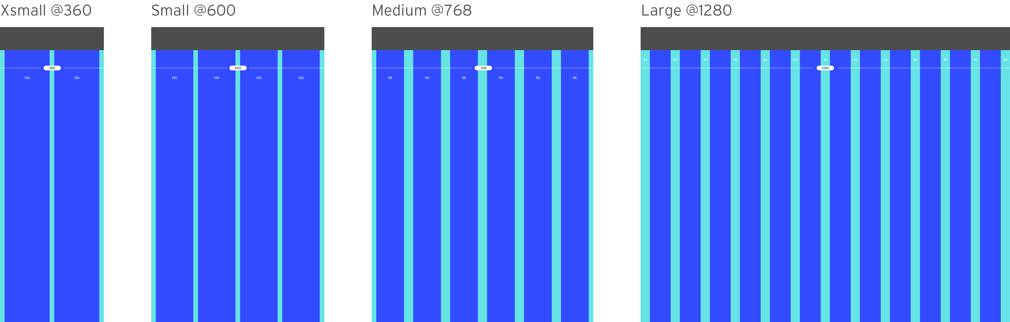
Column grids
Impact
This work helped modernize a desktop-centric developer experience for more flexible, on-the-go use. By improving navigation clarity and responsive usability, the redesign better supported how developers actually discover and consume technical content.
It also created a stronger foundation for future site growth by introducing a more scalable navigation model and a more consistent UI system.
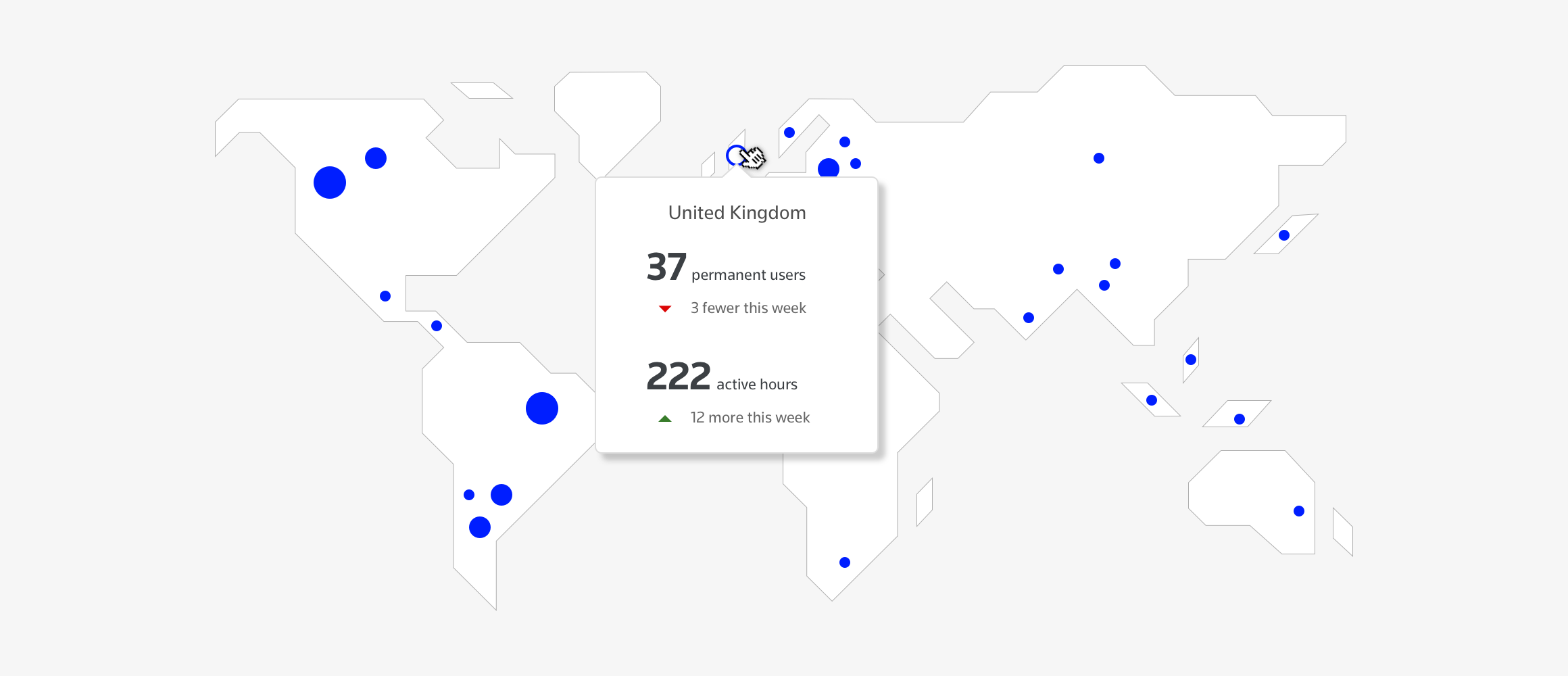
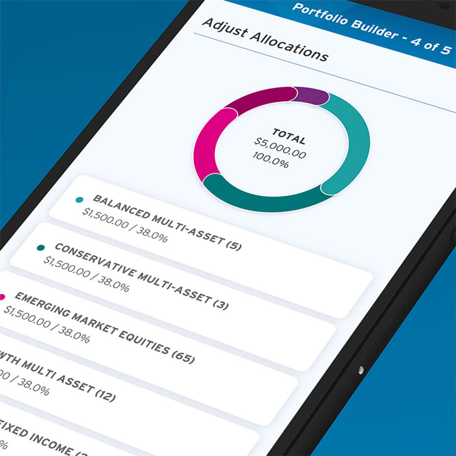
Additional UI concepts
I also explored dashboard concepts to make API service usage feel more visual and engaging for existing customers. These concepts were intended to bring more clarity and energy to product usage data.