-
The problem
How might we optimize and expand balance transfer enrollment?
Balance transfer was a key retention driver, but web enrollment underperformed due to hesitation and confusion.
The UX goal was to drive Balance transfer conversion through clarity and confidence, and explore new growth
-
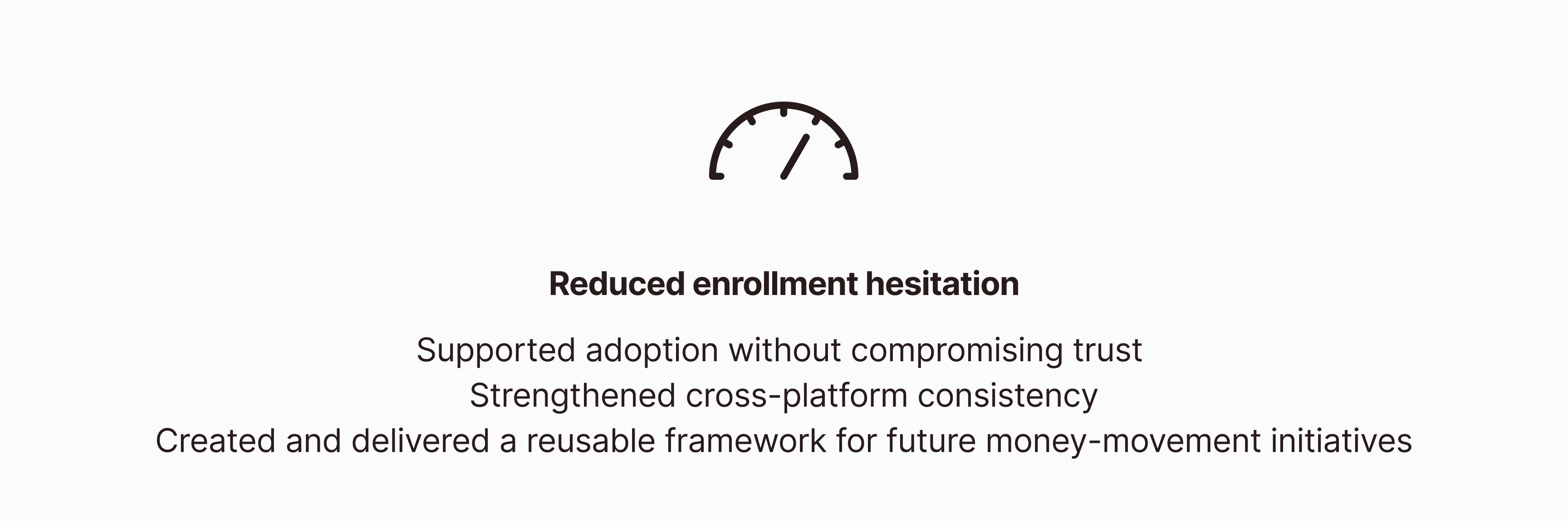
The impact
Clarified the experience to drive confident conversion.
Discovery
Challenging Assumptions about Balance Transfer
I started by looking at how balance transfers are typically used—primarily for debt consolidation, where customers move existing credit card debt to a lower APR to make repayment more manageable.
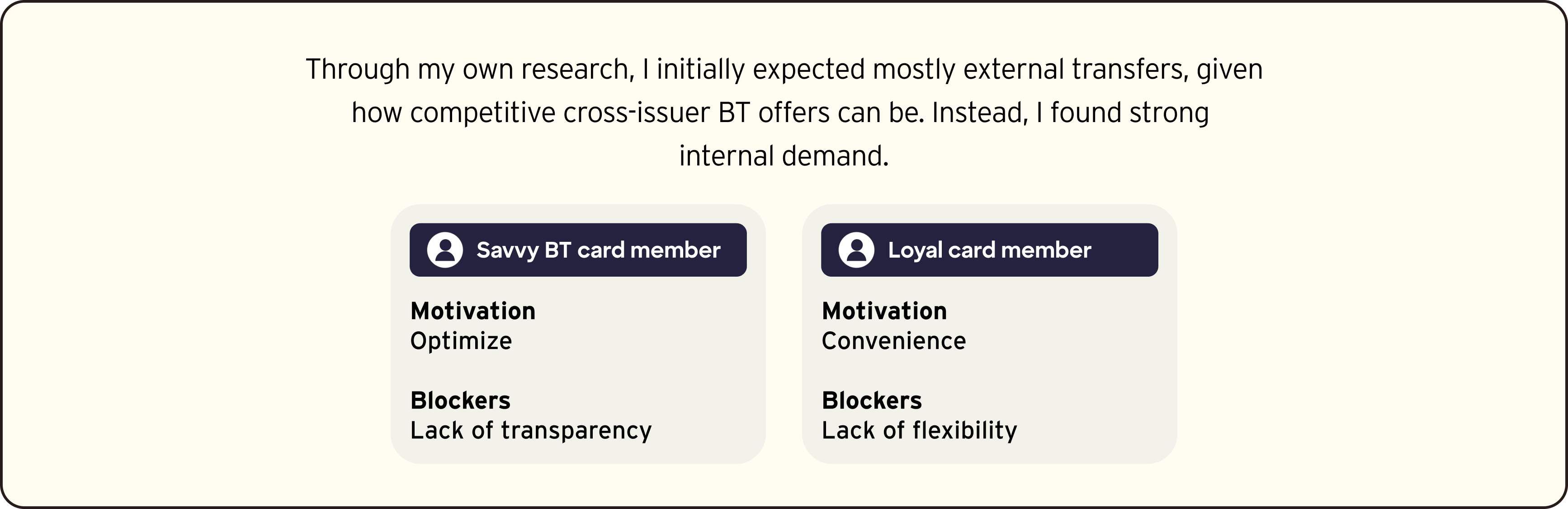
To unpack where confusion was coming from, I compared Balance Transfer, Balance Transfer into Checking, and Cash Advance—revealing overlapping benefits and unclear distinctions that were not well communicated to customers.
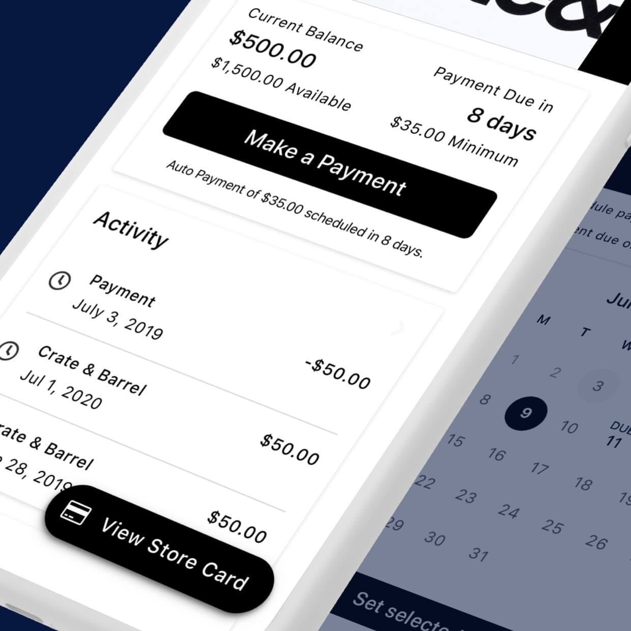
Reviewing old BT Enrollment Flow
UX Review: The web enrollment flow appeared simple, but key offer details weren’t clearly surfaced. Multiple options created decision friction.

Strategy
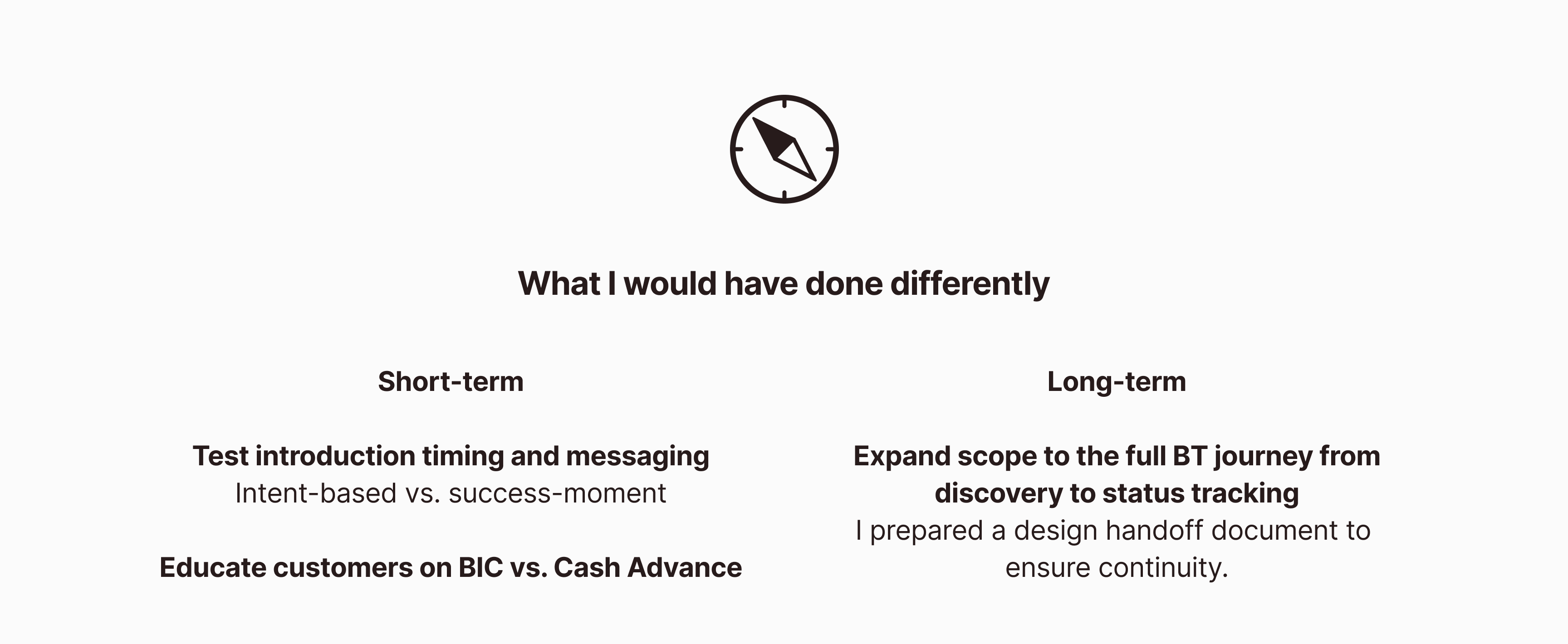
Because hesitation stemmed from both enrollment friction and liquidity confusion, we needed two streams of work. I led a dual-track design approach, balancing near-term UX uplifts with longer-term revenue growth.
1. Optimize - BT Enrollment Flow
Hypothesis: Leveraging the proven mobile pattern will increase BT request completion.
Pros - More focus on a task, replicating effective mobile patterns on web | Cons - Multiple pages


Utilizing Discover design system web components, I generated the optimized flow diagram

2A. Intent-based Framing Design
Hypothesis: Clear, intent-based framing helps drive BIC adoption and stronger BT engagement.
Pros - Makes selection feel intuitive and purpose-driven | Cons - May slow regular BT users

2B. Success-Moment Introduction
Hypothesis: BIC engagement increases when introduced after BT completion.
Pros - Leverages positive momentum after completion, opportunity for contextual education
Cons - Reduced urgency compared to pre-enrollment framing

Solution
The implemented version
We chose intent-framing upfront to clarify the transfer before commitment.

Impact